Jepika Paints
2024
Making product discovery effortless for a paint brand
A ground-up website redesign built through competitor research, user personas, and iterative client feedback
Overview
Building trust before the first conversation
Jepika Paints is an emerging paint company competing against established names with more brand recognition and customer trust already built in. Their existing website undercut that effort: it made the products hard to browse and gave visitors no real sense of who Jepika was as a brand.
As the designer, my role was to take Jepika's brand vision into a professional, market ready website that aligned with client goals. That meant creating homepage layouts, gathering feedback, and developing inner page designs that maintained visual consistency across the site. I collaborated closely with the client and developer, ensuring smooth transitions from design to implementation. My work emphasized usability, visual balance, and alignment with the client's evolving brand direction.
Problem
A brand that didn't look the part
Jepika's existing online presence didn't reflect the brand they were trying to build. When I looked at competitor sites like Since Paints and Gem Paints, it was clear where Jepika was falling behind: navigation that made it hard to focus, inconsistent storytelling across pages, and not much brand identity beyond the logo.
The real question wasn't how to make it prettier. It was: how might we create a modern identity that helps Jepika build trust with customers who are still deciding between paint brands?

Impact
A direction the client could stand behind
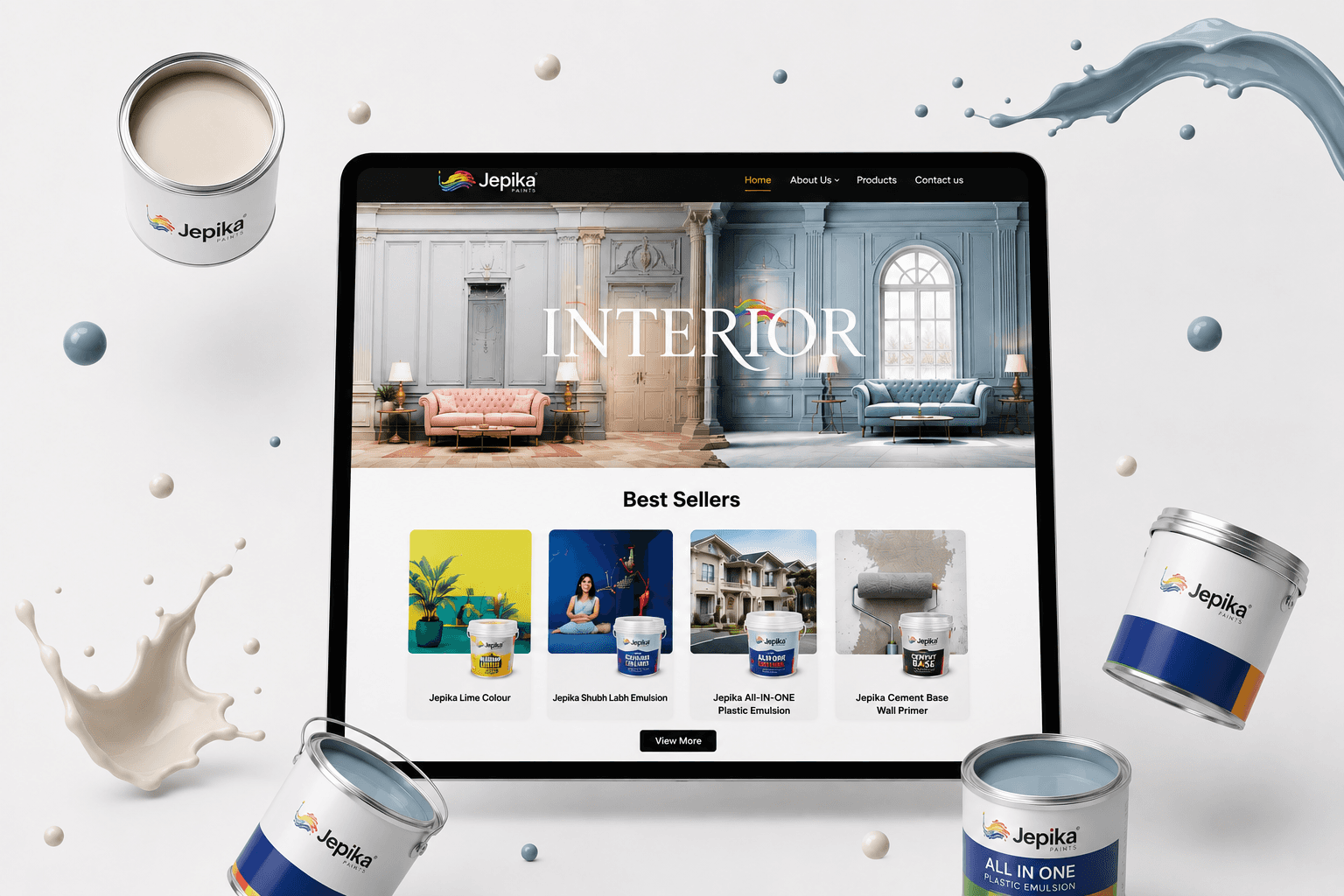
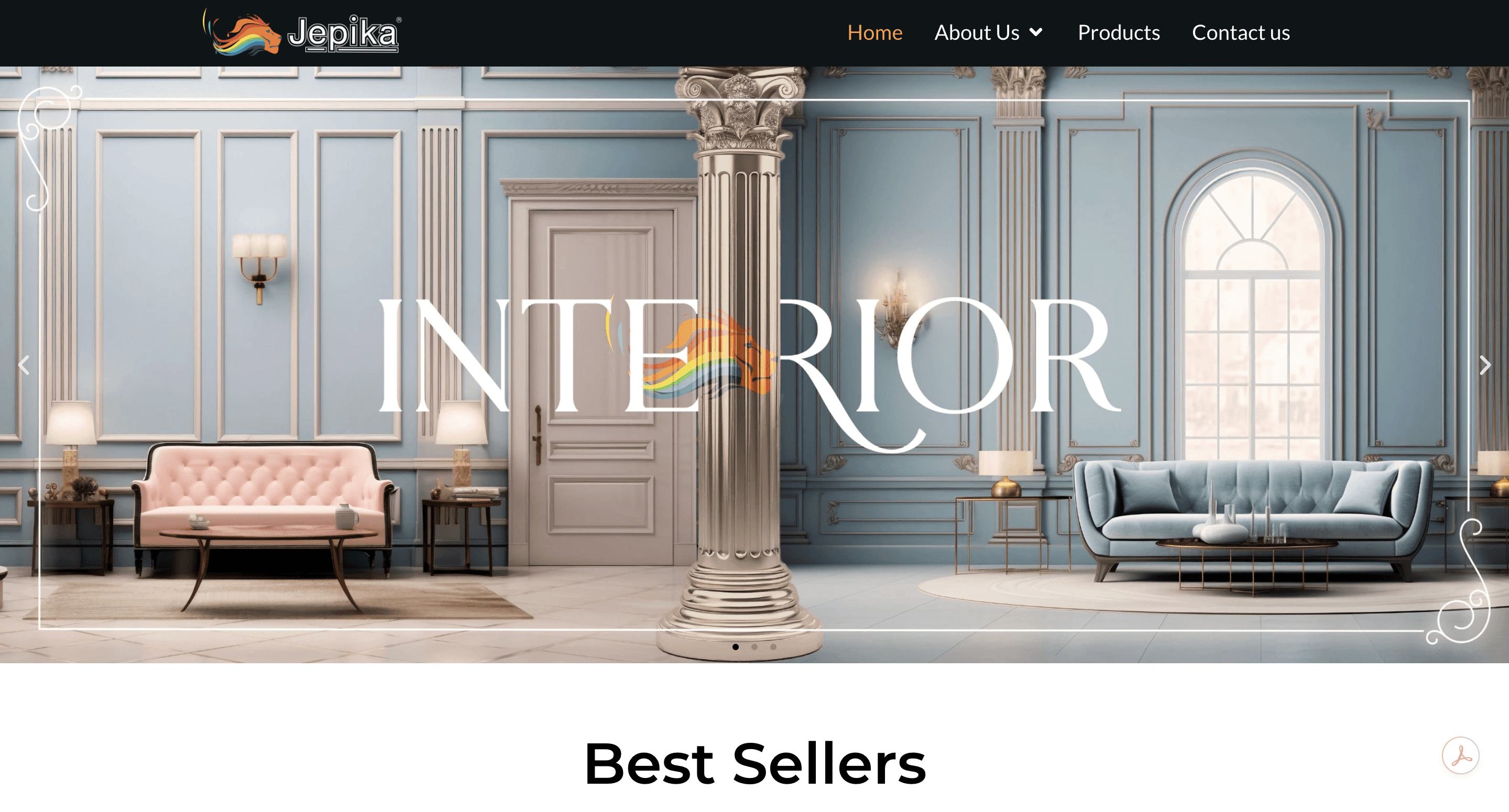
The redesign gave Jepika a clean, structured homepage where product discovery doesn't compete with clutter, and a visual identity that actually carries through every page instead of stopping at the logo.
I brought three homepage directions to the client, each with a different balance of layout, tone, and visual weight. After walking through the tradeoffs of each one, the client chose the most modern, structured direction and felt confident it matched how they wanted to be seen in a competitive market. That decision is the clearest proof the redesign worked. It wasn't just visually stronger, it was something the client could stand behind.
Process
Getting from problem to a direction that worked
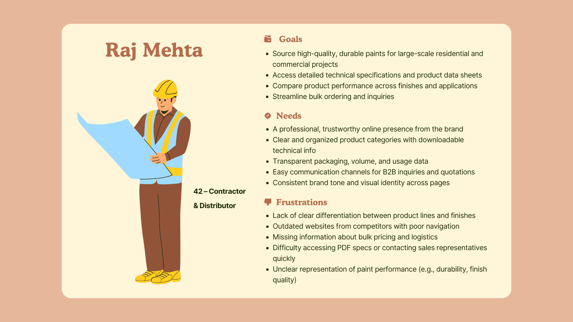
I built a persona around Raj Mehta, representing Jepika's core customer: a contractor or multi-site retail buyer who needs to move fast, compare products, and trust a brand enough to commit without hesitation. His biggest frustrations were slow product discovery and unclear communication, so those became priorities from the start.
The client wanted a bold, modern design with a dark theme, and asked for at least two homepage options to choose from. The manager wanted homepage priorities handled first, then a clean handoff to developers. I used both to sequence the work: homepage direction first, then everything else.
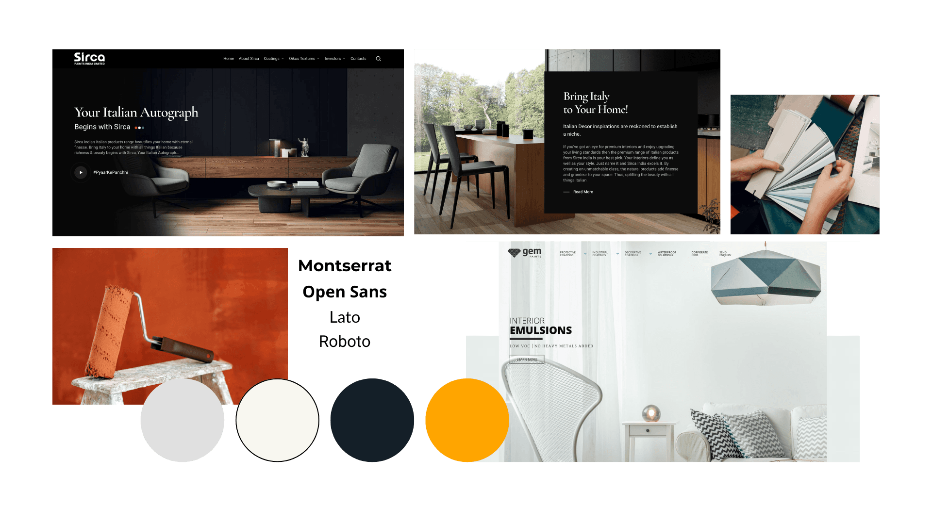
A heuristic evaluation of competitor sites surfaced four real issues: cluttered visuals that made navigation harder to follow, weak storytelling around products, inconsistent branding, and inquiry paths that were easy to miss. From there, I framed a brand position: Jepika needed to feel like a sophisticated, trustworthy paint company, with enough visual clarity to read as credible at a glance. A moodboard grounded this in sleek layouts, clean typography, and bold contrast against dark backgrounds, drawing from modern industrial and interior design references.
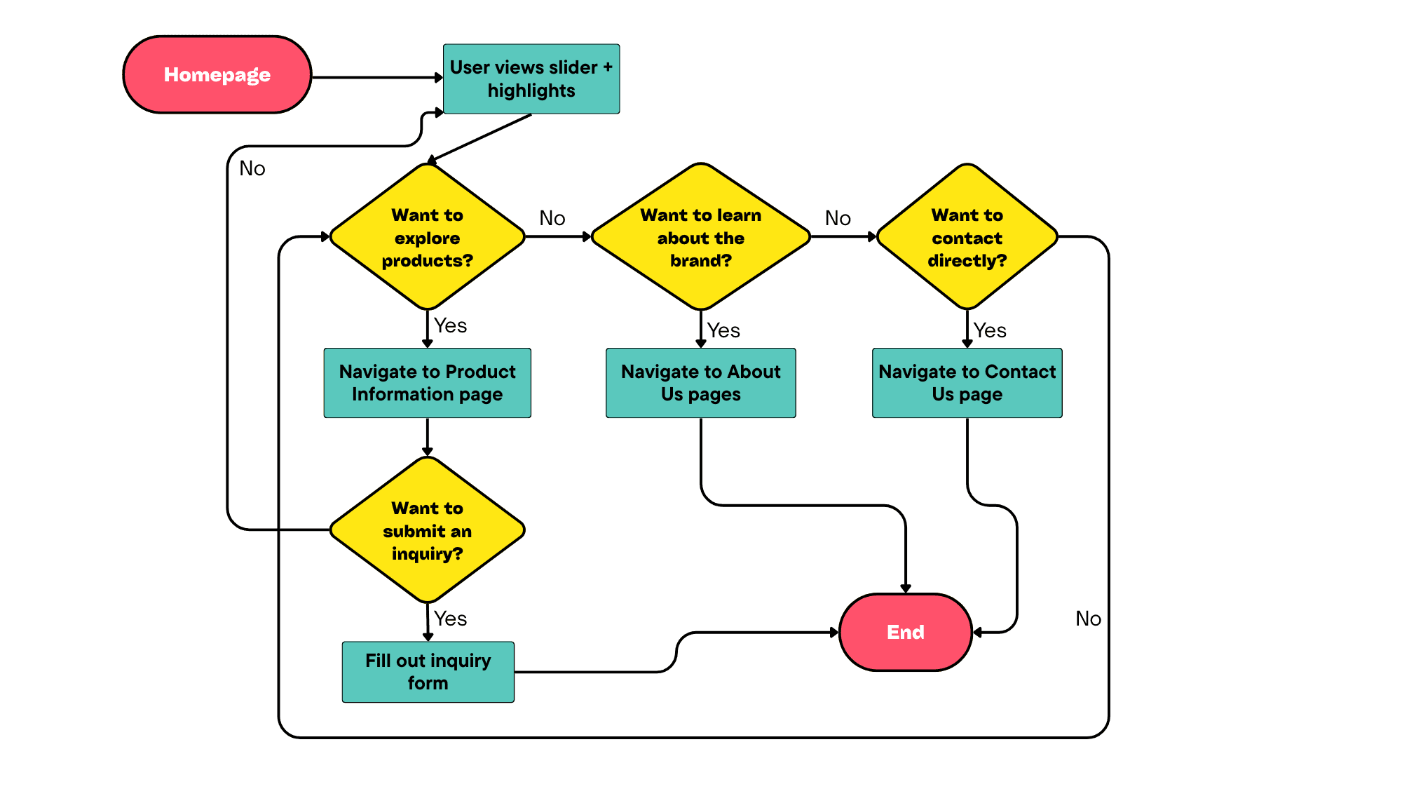
I mapped out a user flow to simplify how someone moves through the site, from homepage to product discovery to inquiry, making sure the path to "contact us" was never more than a couple of clear steps away. Three homepage wireframes let the client compare layout, hierarchy, and visual emphasis side by side before we picked a direction, instead of presenting one option and hoping it landed.
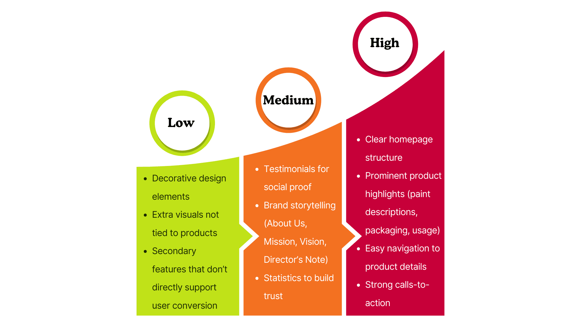
A prioritization matrix kept decisions grounded in what the client actually needed. Homepage clarity and product highlights ranked highest, testimonials and storytelling came next, and decorative extras came last. The final style was built on the client's existing brand colors (orange, deep grey, off-white) with Montserrat for headlines and Lato for body copy, keeping everything consistent across the site.
Reflection
What this project taught me
This project showed me how much a clear brand identity does for trust, even before someone reads a single word of copy. Layout and visual consistency tell people whether a company feels credible. Working from concrete gaps like the heuristic evaluation, instead of a vague "make it modern" brief, also helped me stay focused on decisions I could actually explain, not just ones that looked nice.


