Manar Polymers
2025
A B2B site for technical buyers and executives
Building a new manufacturer's first digital presence through research, information architecture, and iterative design

Overview
A first impression that had to do a lot of work
Manar Polymers is a newly established, India based rubber manufacturing company specializing in custom rubber and polymer profiles for industries like automotive, industrial, railways, marine, and oil and gas. As a new company, they needed a website that could establish their digital presence and communicate their manufacturing capabilities, product range, and technical expertise from the ground up.
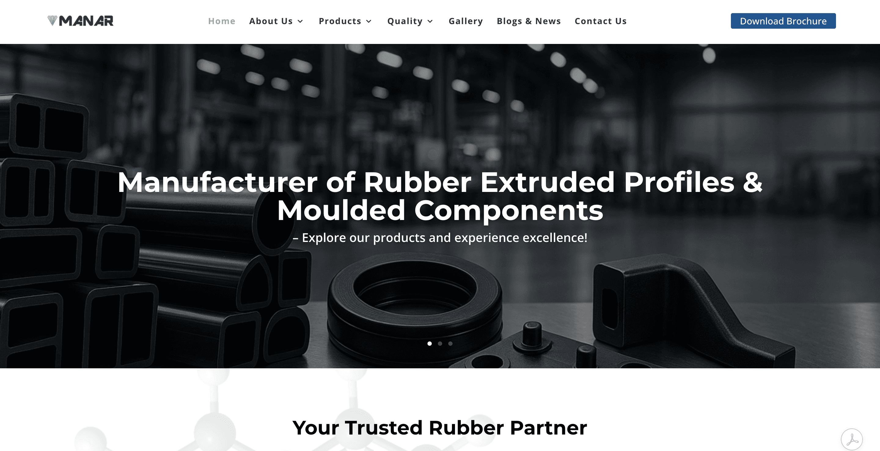
As the designer, I worked across homepage exploration, product page layouts, and structured navigation systems for their B2B site. Throughout the project, I emphasized modern, credible visuals while structuring information to improve usability and readability for B2B clients.
Problem
Starting from zero
Since Manar Polymers is a newly established company, they had no existing website and no digital presence at all. That meant a large amount of technical information (product specs, manufacturing capabilities, quality standards, industrial applications) had nowhere to live online, and no way to be discovered by the B2B clients they needed to reach.
The challenge wasn't just building a site. It was designing one that could hold and organize that much technical depth without overwhelming the people trying to navigate it, from procurement managers to engineers evaluating a brand new supplier for the first time.
Impact
A credible presence from day one
The final site gave Manar Polymers a structured, modern digital presence and, since they had no website before, its first real chance to be found and evaluated by B2B clients online. Feature prioritization kept the build focused on what would matter most to a new company trying to earn trust: structured product pages, industrial category navigation, quality and testing information, and a clear way to make contact.
Since this was their first website, the clearest proof point is what it made possible: for the first time, international clients researching Manar Polymers could actually understand what they do and see them as a credible, modern manufacturer, despite being new to the market.
Process
Structuring depth without losing clarity
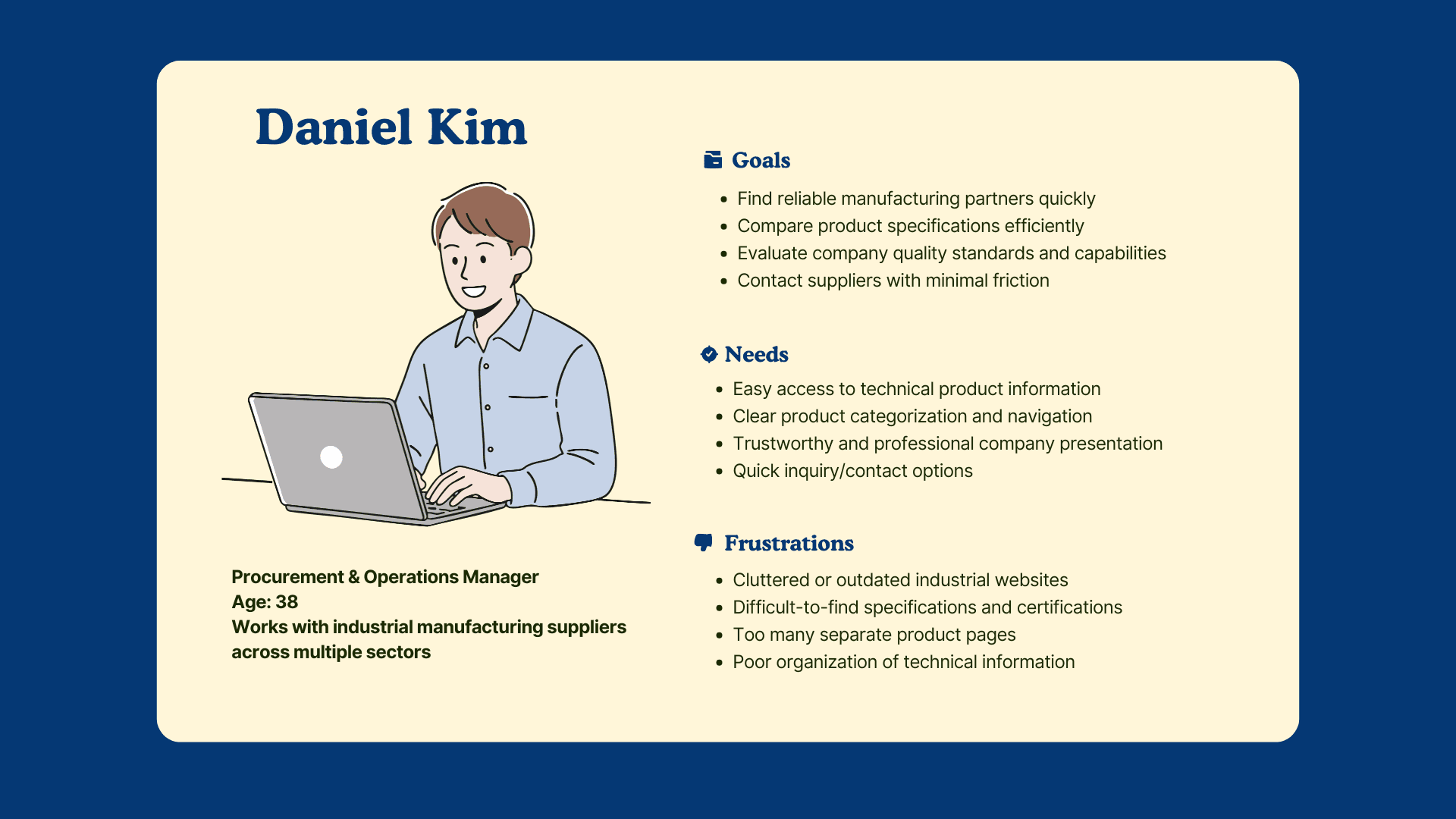
I built a persona around Daniel Kim, representing the kind of visitor who lands on an industrial B2B site like this: someone looking for product specifications, manufacturing capabilities, and reliable supplier information, who expects to find it quickly without digging.
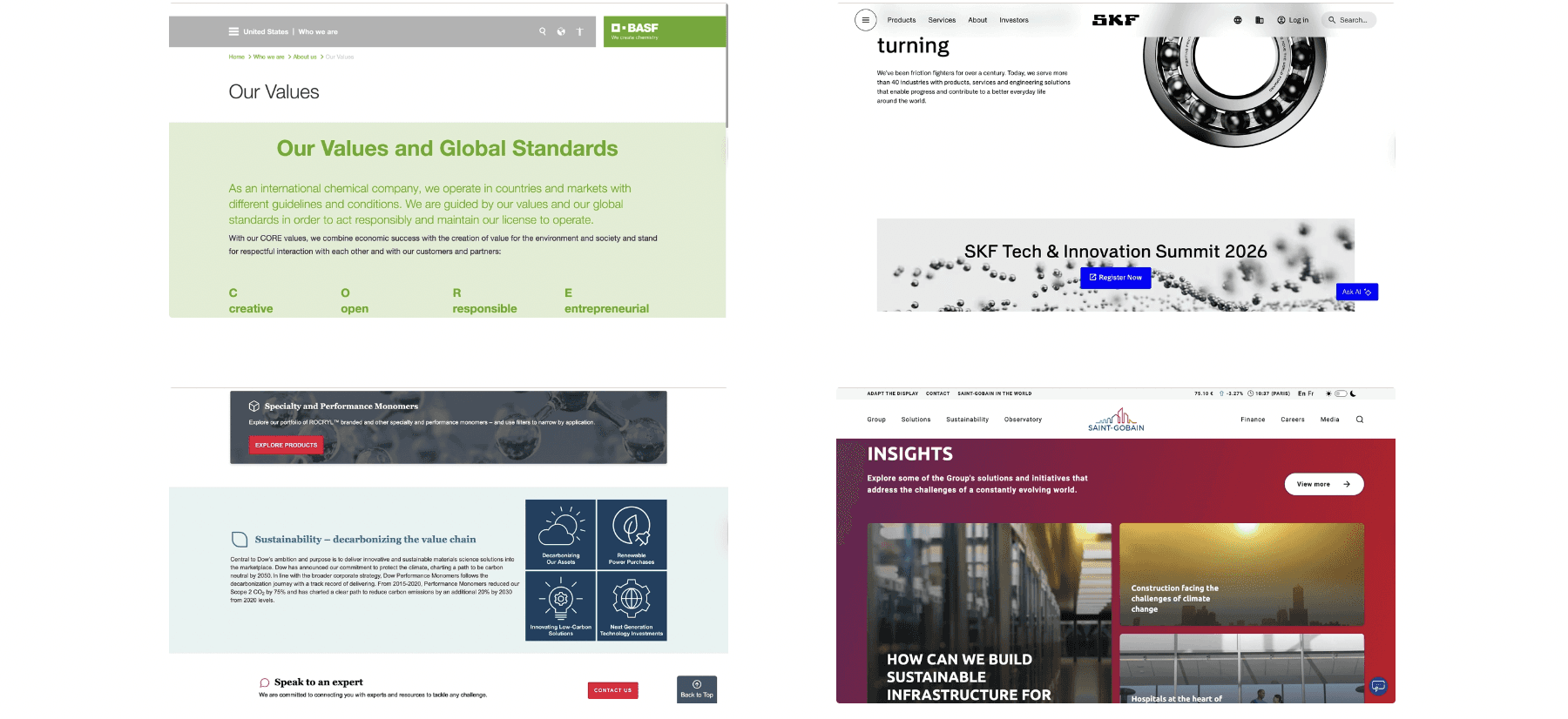
I researched B2B and industrial websites to understand how similar companies balanced dense technical content with clean visual identity. Common issues stood out across the space: outdated or cluttered visuals, hard to navigate technical information, and no fast way to compare product categories. That research made the problem clear: as a brand new company, Manar needed a site that felt established and credible on day one, without overstating what they didn't yet have a track record for.
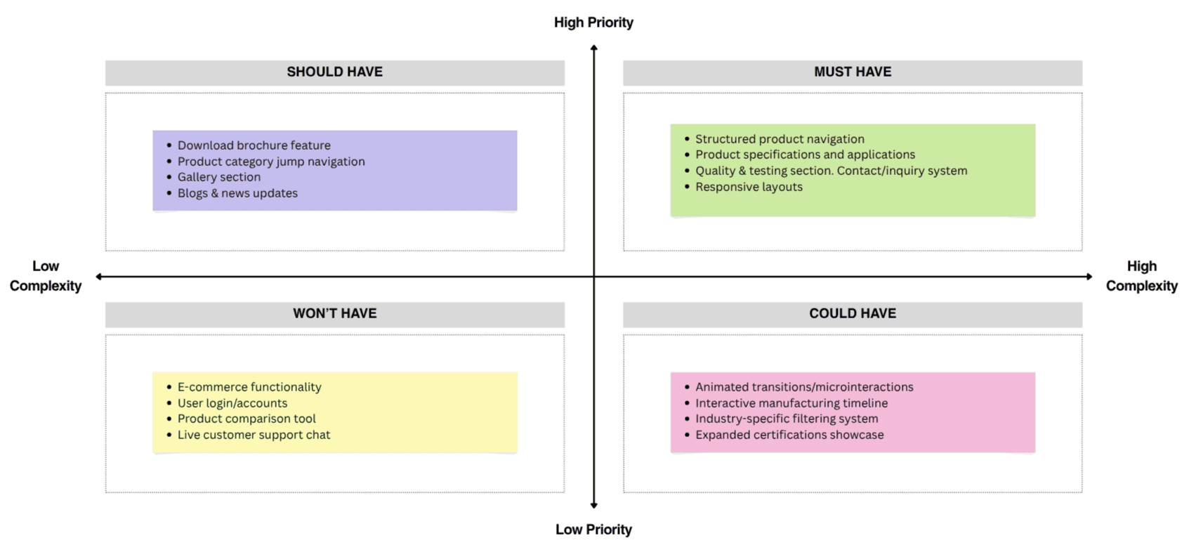
A feature prioritization exercise kept the build focused on what actually mattered for a new company trying to earn B2B trust: structured product pages, industrial category navigation, contact and inquiry systems, and responsive layouts, rather than trying to design everything at once.
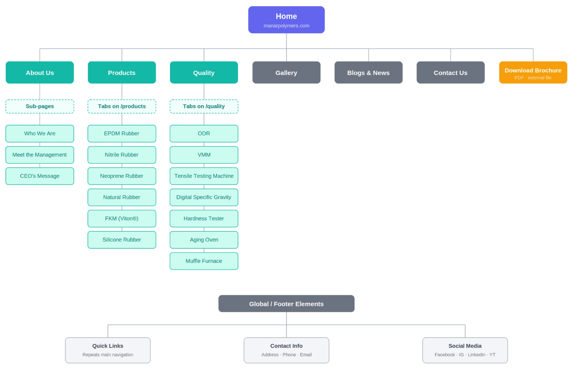
The biggest challenge was information architecture. Products were originally spread across separate pages, so I consolidated them into a more centralized navigation system and moved to tab-based product pages. This made it easier to browse related categories, reduced unnecessary clicks, and carried through to how the quality and testing section was organized as well.
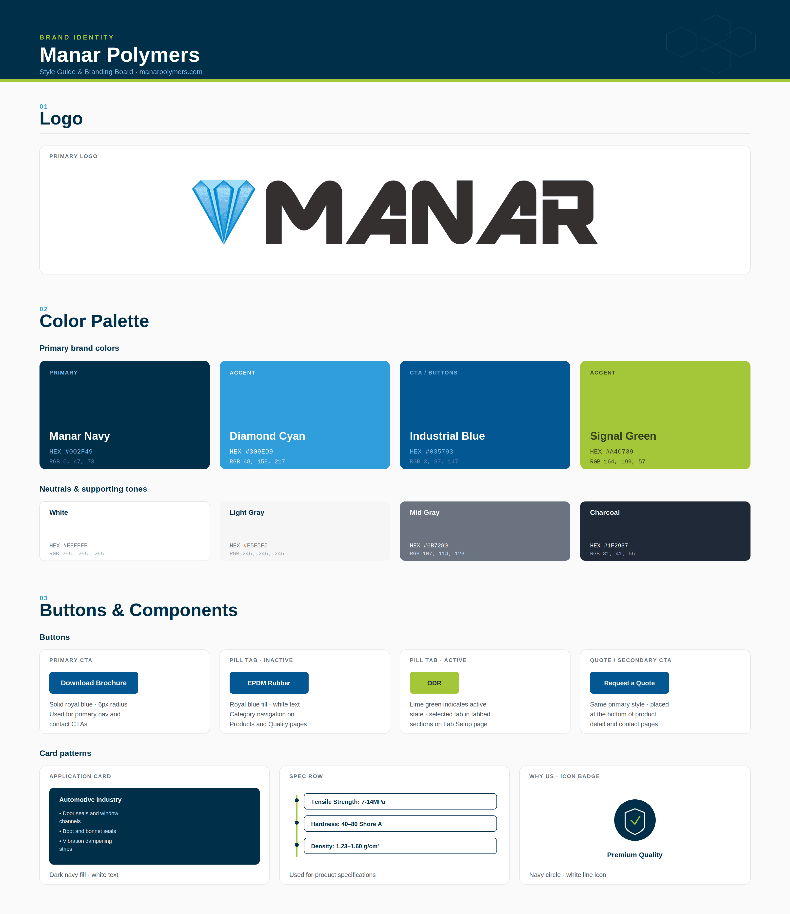
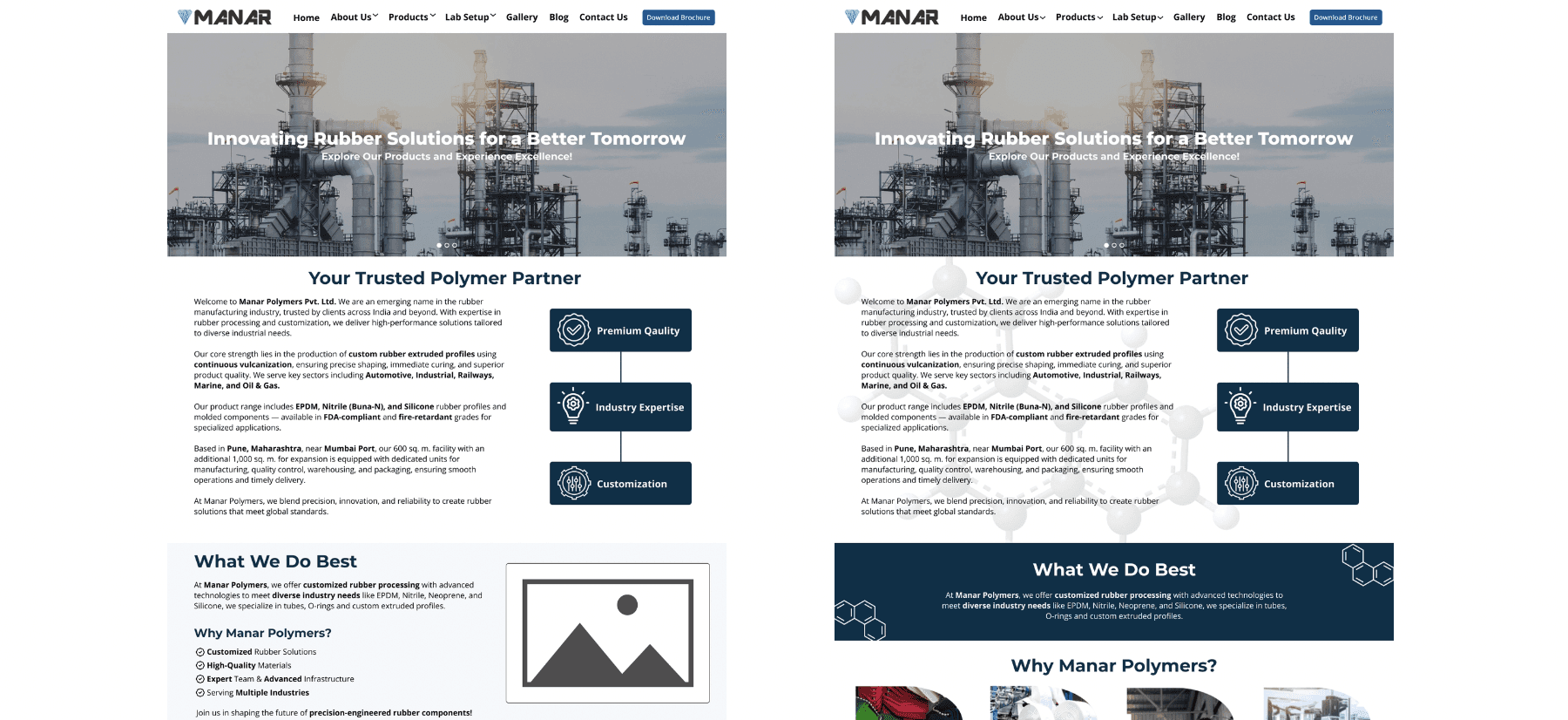
Early wireframes focused on structuring information-heavy pages into readable sections, and the homepage went through multiple layout explorations before landing on something that balanced modern visuals with clear hierarchy. The final visual direction paired a clean, corporate aesthetic with a blue accent color pulled from the logo, aiming for a site that felt professional and established, even as a new company entering the market.
Reflection
Designing credibility, not just an interface
This project taught me how to design credibility, not just an interface. A newly established company doesn't have years of reputation to lean on, so every layout decision and piece of content had to work harder to earn trust. Reworking the information architecture midway through, instead of forcing the original page structure to work, was one of the more valuable calls I made. It's a good reminder that the first structure isn't always the right one.